I collaborate with the development team to create engaging and intuitive websites for SaaS clients. Combining my expertise in WordPress with a deep understanding of the user experience, I work closely with the Growth Manager to design websites that drive sales and conversion rate optimization.
Professional marketers seeking a comprehensive SaaS solution to streamline their marketing processes.
Tech-savvy individuals who prioritize efficiency and productivity in their work.
Goal-oriented individuals who value data-driven insights to make informed marketing decisions.
Grid system
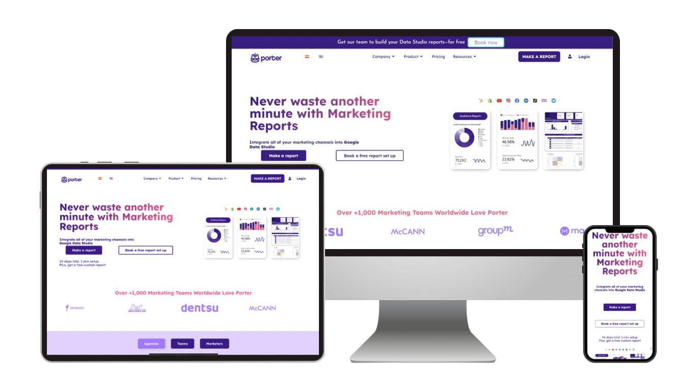
Grid design provides structure and organization to a website.
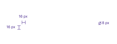
Ensures consistent spacing and alignment of elements.
Make the website more visually appealing and easier to navigate.
Why typography matters for a SaaS?
Typography: Consistent and easy-to-read fonts, such as Lexend Deca, are crucial in improving the user's perception of a SaaS brand, leading to better KPIs such as conversion rates, readability, and legibility, while reducing user fatigue.
Scale: Proper scaling ensures legibility across different screen sizes, particularly on mobile devices, which are used by over 60% of SaaS users, leading to increased engagement and retention rates.
Tags: Appropriate tags improve content organization, visual hierarchy, and SEO, helping users to find relevant information. They also enable easy modifications to typography, size, or color throughout the website structure.
Tags
Weight
Typography
H1
3.052 rem / 50 px
Lexend Deca
H2
2.441 rem / 40 px
Lexend Deca
H3
1.953 rem / 30 px
Lexend Deca
Button
1.25 rem / 20 px
Lexend Deca
P
1 rem / 16 px
Lexend Deca
ST
0.64 rem / 10 px
Lexend Deca
Call to action
Developing a consistent button style guide can improve the visual appeal and recognition of a SaaS company.
Careful use of color in button design based on brand guidelines can increase visual interest and engagement.
Proper sizing, shaping, and placement of buttons with high contrast can enhance usability, simplify user flows, and optimize the overall user experience.
A contrast tester can help ensure that the colors used in a SaaS company's design, including buttons, have sufficient contrast for accessibility and readability.
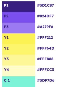
Color
Contrast
Ranking
Purple
12.5
★★★★★5/5
Yellow
11.10
★★★★★4/5
Blue
10.17
★★★★★4/5
Pink
6.88
★★★★★3/5
Interactive UI Animations
Cards
Provide a clear and organized way to display information, helping users quickly identify and access the content they are interested in.
Icons can improve hierarchy and aid in navigation, making it easier for users to find what they need and ultimately improving the overall user experience.
We specialize in creating customized website guidelines that reflect the unique needs and goals of your business.
Don’t let inconsistency and confusion undermine your online presence. Contact us today to get a quote and take the first step towards a more effective and cohesive website.